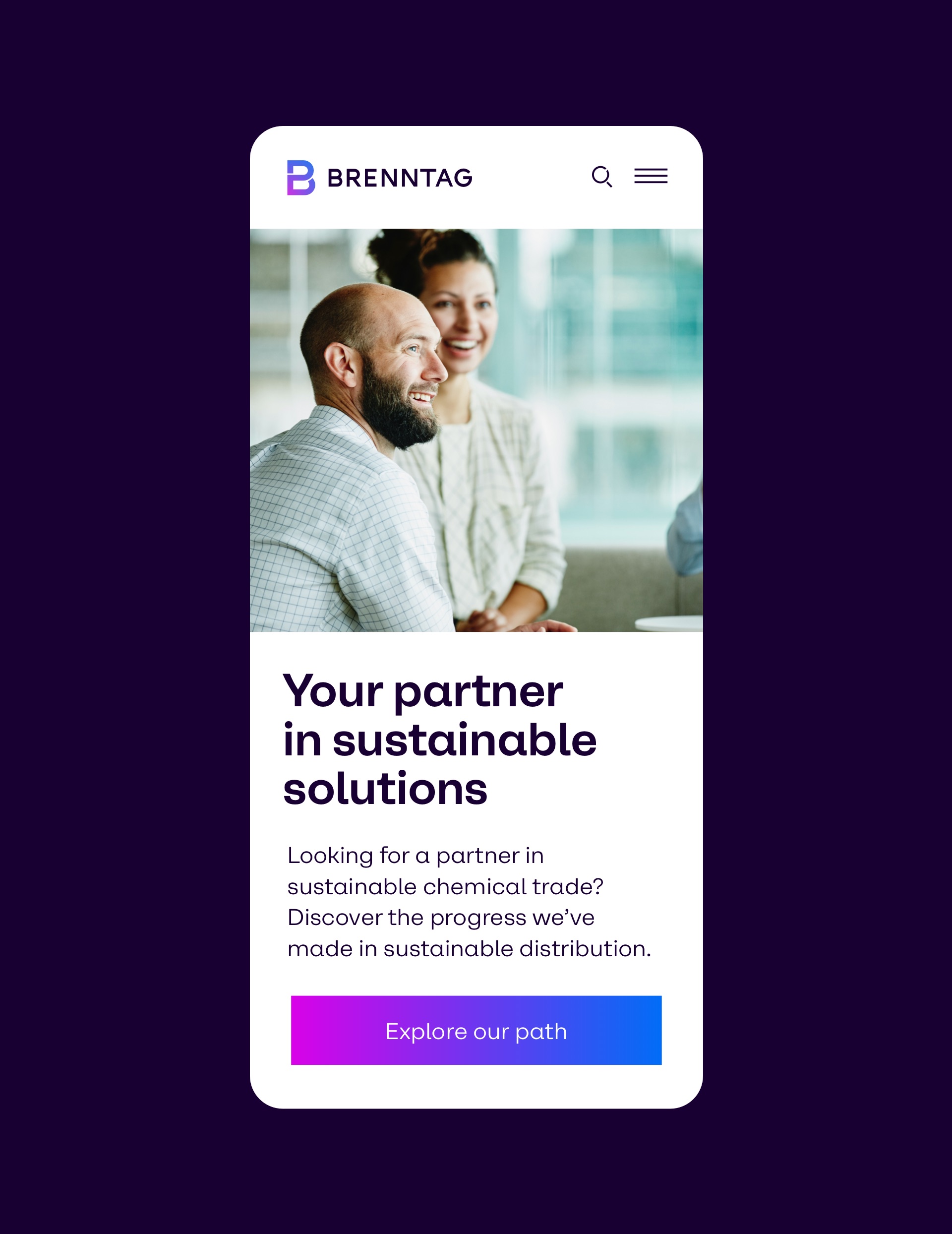
Brenntag is a global market leader in chemical and ingredients distribution. For their 2022 rebrand, Hamburg based design agency Mutabor commissioned a custom typeface that works as one of the main ingredients of the new identity.

The objective was to highlight the convergence of human and technology, a key element of Brenntag’s new strategy. Naturally, a global player like Brenntag must communicate in a sleek and functional manner. This was accomplished by integrating humanistic nuances, like a tail on the geometric ’a‘ and understated curves on ’A‘, ’V‘, ’W‘, or ’X‘, into the framework of a classic Grotesk typeface.


Six regular widths styles have been complemented by six space-saving styles specifically designed for copy texts. Each subfamily spans from Regular to Black and features an extended glyphset. All weights have been meticulously optimized to ensure optimal performance across both print and digital applications.

To comprehensively serve the company’s diverse markets, the typeface was meticulously crafted in three scripts: Latin, Greek, and Cyrillic. The family offers support for over 200 languages worldwide, ensuring comprehensive coverage across diverse linguistic needs.