As one of the world’s leading manufacturers of automobiles and commercial vehicles, The Volkswagen Group claims a key role in shaping the transformation to a new age of mobility with its iconic brands, business areas and financial services.

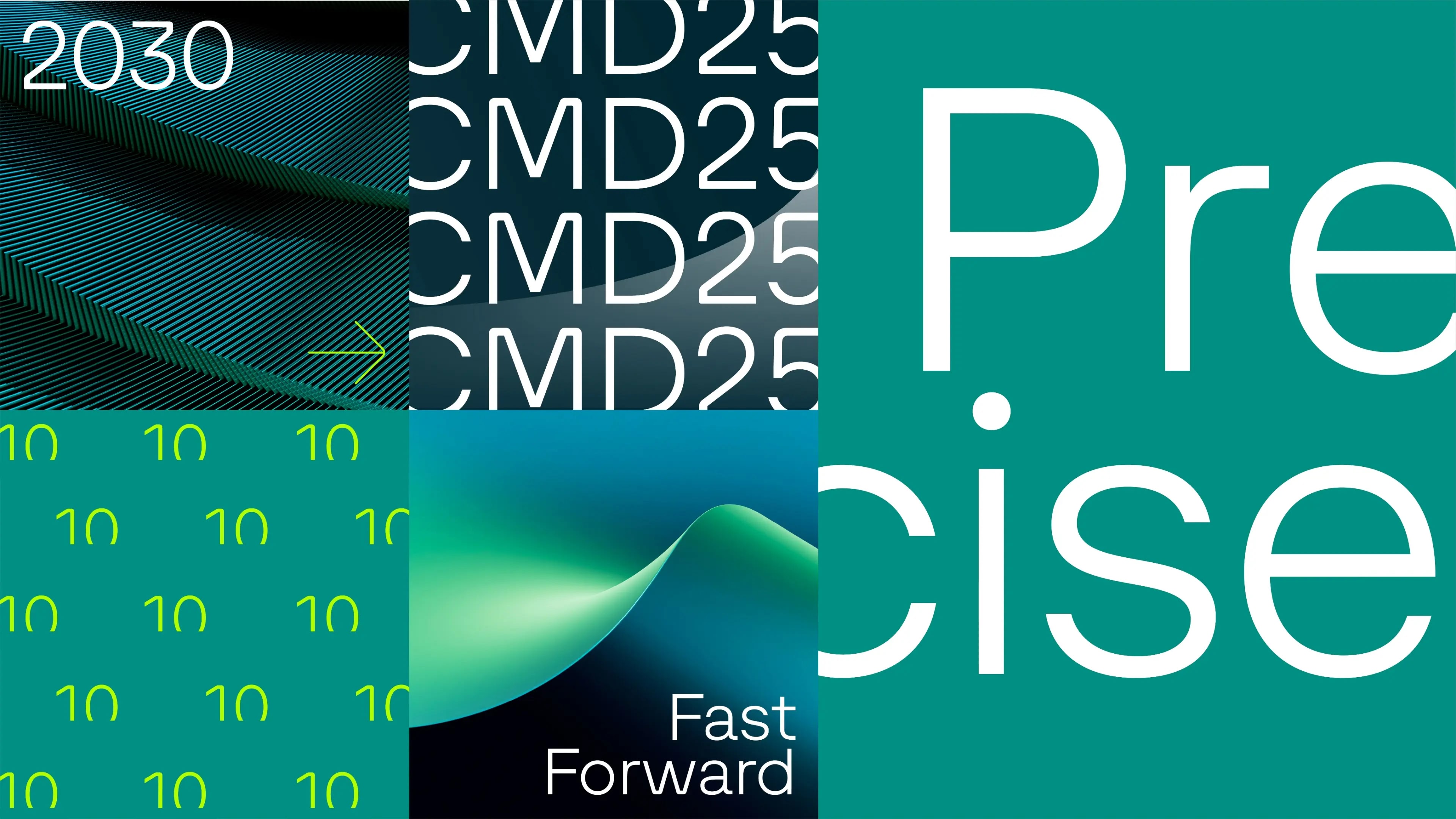
The new visual identity, designed by Landor, supports the biggest strategic transformation in the brands history as it evolves into a software-centric global leader in sustainable mobility by 2030. The new typeface functions as strong defining elements, representing the brand to the outside world and internally triggering a new sense of unity and motivation – selected imagery by Landor.


The newly created wordmark served as a source of inspiration for the DNA of the font family. Distinctive features such as the rounded corner elements of “O” and “G”, the middle-bar of “K” or the terminals of “S” and “G” were incorporated into the typeface and consistently developed further.


Within the family structure the two headline styles “Light” and “Light Italic” serve as brand ambassadors. They are used in large font sizes to communicate the new brand goals. For use in small font sizes, a space-saving text subfamily was developed. It is available in three different weights with corresponding italics. To ensure the optimized display of numbers, the Text subfamily comes with default tabular figures instead of proportional figures.


To comprehensively serve the brands diverse markets, the typeface was designed in three scripts: Latin, Greek and Cyrillic. The family offers support for over 200 languages worldwide, ensuring comprehensive coverage across diverse linguistic needs.


Designed as a unified typographic system, the typefaces bring clarity and consistency to every touchpoint across the Volkswagen Group—spanning digital interfaces, corporate communication, and brand-specific applications.