Voith is a global technology group quietly shaping the world’s most essential industries. From hydropower and paper production to industrial mobility, its technologies support the infrastructure that keeps the world moving. Founded in 1867, Voith combines engineering excellence with innovation to drive progress.


As part of Voith’s comprehensive rebranding led by design agency Mutabor, the Studio was responsible for the development of a custom typeface, strengthening the brand’s visual identity and ensuring consistency across all applications.


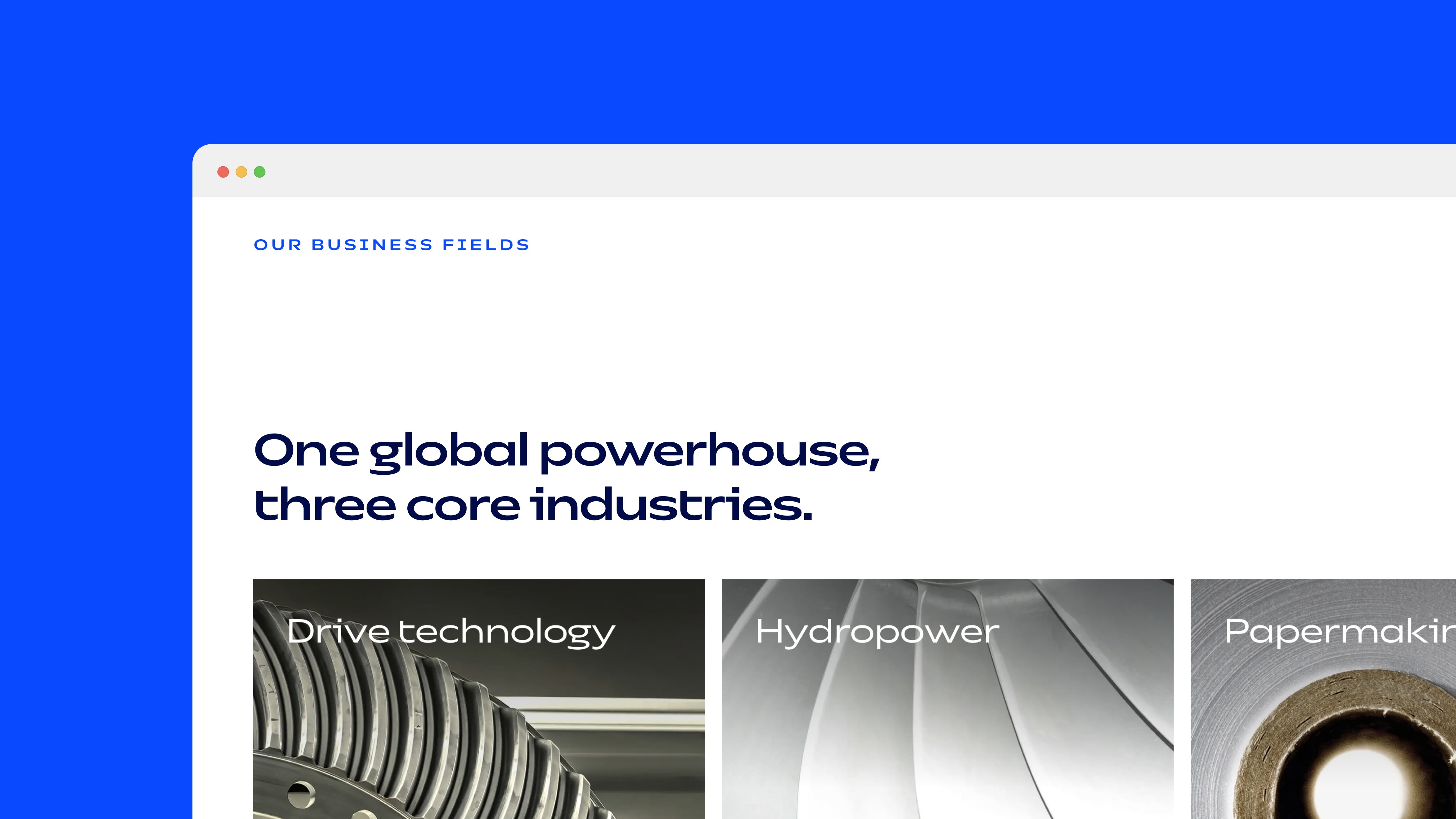
Inspired by turbines, rotor blades, and industrial machinery, sharp angles and streamlined forms define the typeface’s visual character. Its wide proportions reflect the scale and engineering precision at the core of Voith’s identity. Details such as the spurless “f” and “t,” alongside a distinctive, open “g,” reinforce clarity and movement, expressing the brand’s values of precision, innovation, and performance.


The precision and structural logic of the letterforms extend to the numerals, creating a consistent visual language throughout the typeface. Tabular figures are the default, providing precise alignment and clarity in numerical applications. Their technical character and functional design make them particularly suited to data-intensive environments.


The typeface is equipped with an extended Latin character set, comprising more than 500 characters per style. This ensures consistent communication across international markets.


The typeface is available in two widths: Normal and Wide, each offered in four styles. The wide styles are designed for expressive headlines, while the normal width is optimized for continuous reading and body text. All styles support both digital and print applications, ensuring consistency and clarity throughout the entire system.