Fabasoft delivers secure cloud software for document management, workflows, and digital collaboration. Trusted by governments in Germany, Austria, and Switzerland, the company stands for digital trust, transparency, and long-term reliability.


The project was initiated by Fabasoft as part of a comprehensive brand redesign, led by Salzburg-based agency Solid & Bold. As their typography partner, Studio René Bieder was brought on to develop a custom typeface that would reflect the brand’s values and support its transformation.


The project began with the development of a custom wordmark, building on early logo concepts by Solid & Bold and key elements of the original identity. Italic angles, diagonals, and characteristic shapes were refined into a coherent design language, forming the basis of a flexible logo system. This evolved into a dedicated logo typeface designed to support Fabasoft’s entire brand architecture, including all sub-brands.


Building on the logo typeface, the design process naturally extended into a full text family. Core elements were already defined, allowing the development to progress from a Black Italic to an upright Black, which then informed the remaining styles. To reflect Fabasoft’s focus on digital workflows, subtle features inspired by coding fonts were integrated—adding a functional, technical layer to the design.


In a company like Fabasoft, numbers carry weight—often representing sensitive data or large figures. The numeral design strikes a careful balance: rooted in the same construction principles as the letters, they continue the subtle technical tone of the typeface while remaining clear, distinctive, and understated. Nothing playful, but never generic.


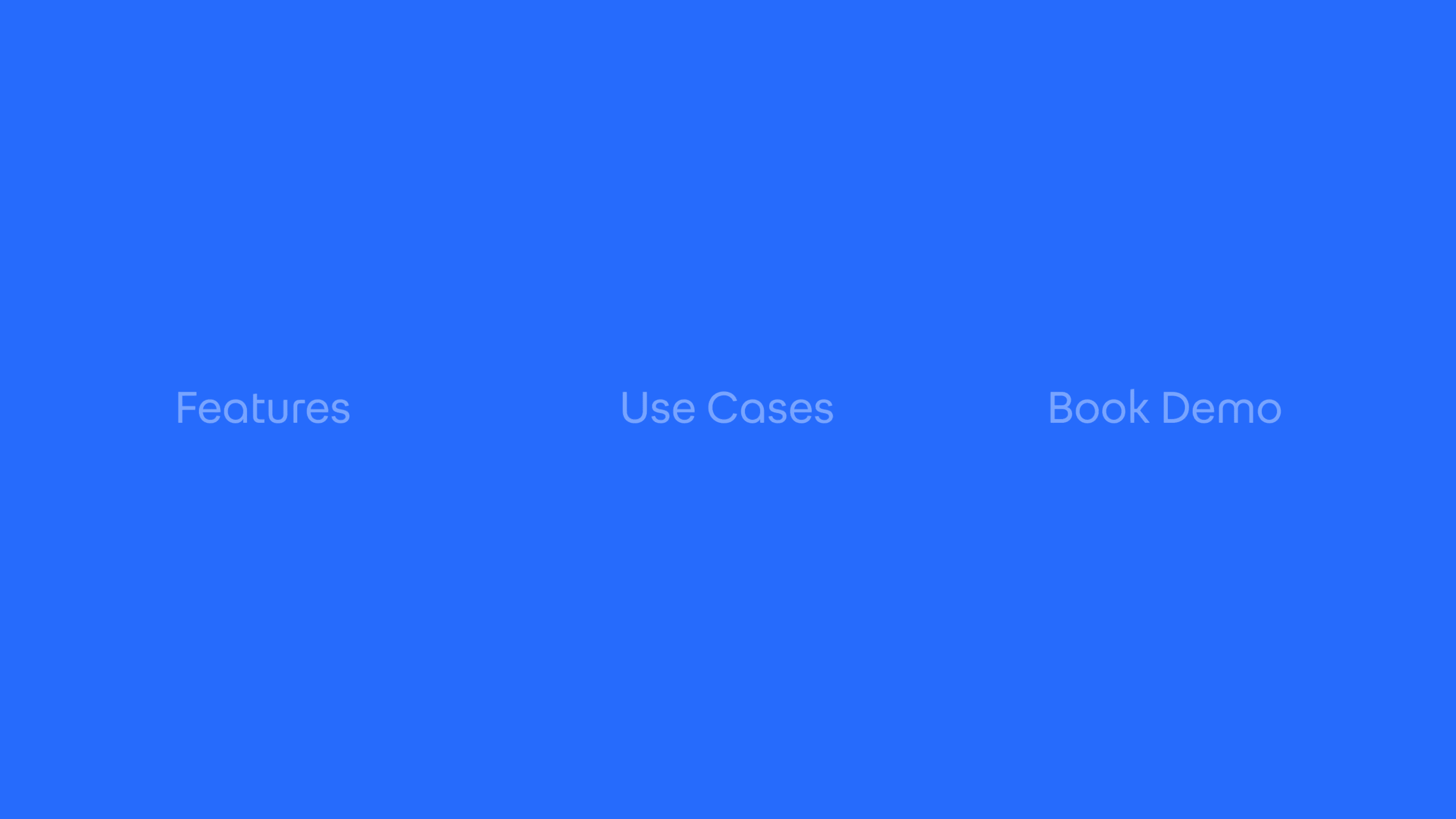
The Fabasoft Sans typeface is available in six styles: Regular, Bold, and Black—each with a matching italic. This setup provides enough typographic flexibility for everything from interface text to bold statements, while keeping the system focused and easy to use.


To ensure consistency across all communication, Fabasoft Sans was equipped with a Latin Extended character set—supporting all major European languages and beyond.


Fabasoft Sans unfolds its character across a wide range of applications—bringing clarity to digital interfaces, authority to printed materials, and consistency to animated brand elements. As part of the broader design system, the typeface helps express the precision, structure, and trust at the core of the Fabasoft brand.