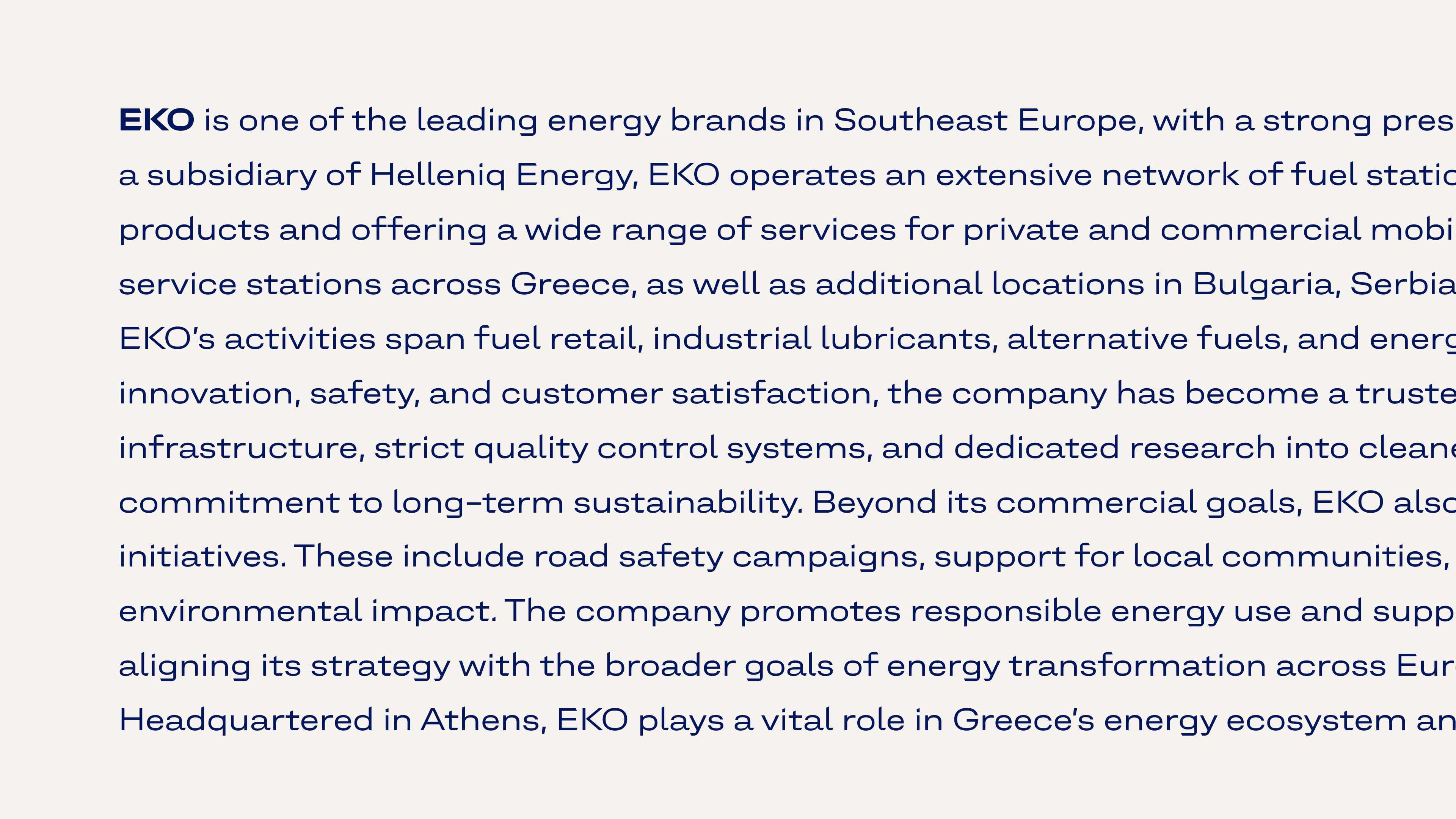
EKO is a leading petroleum brand in Southeast Europe, trusted by customers for its focus on quality, service, human development, environmental responsibility, and social awareness.
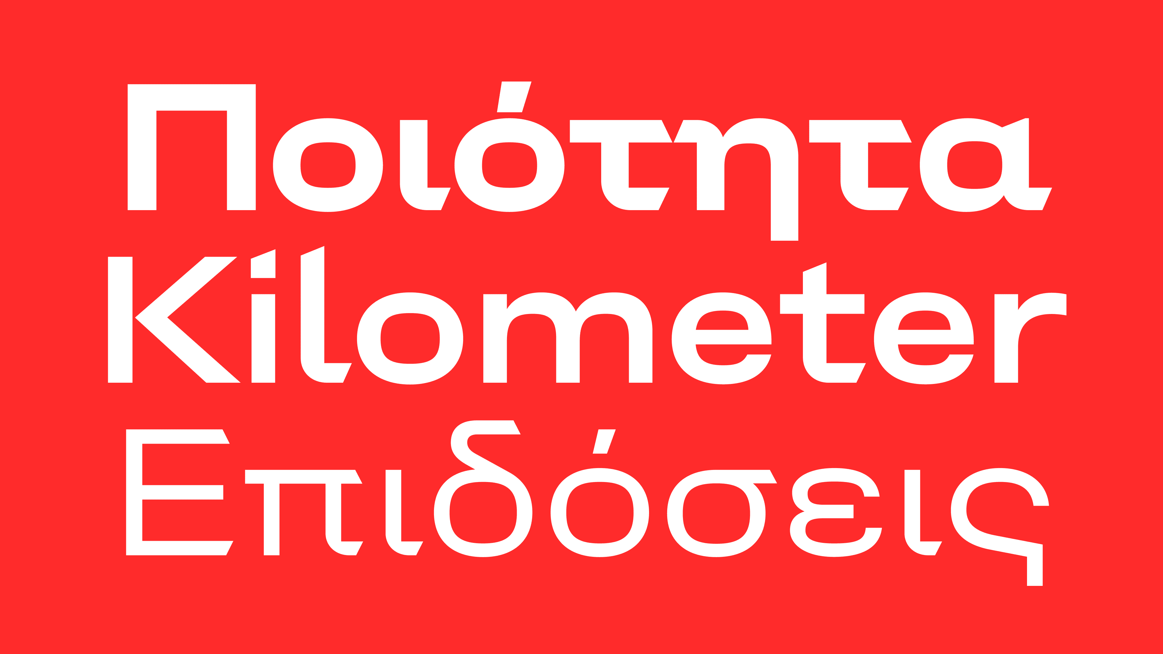
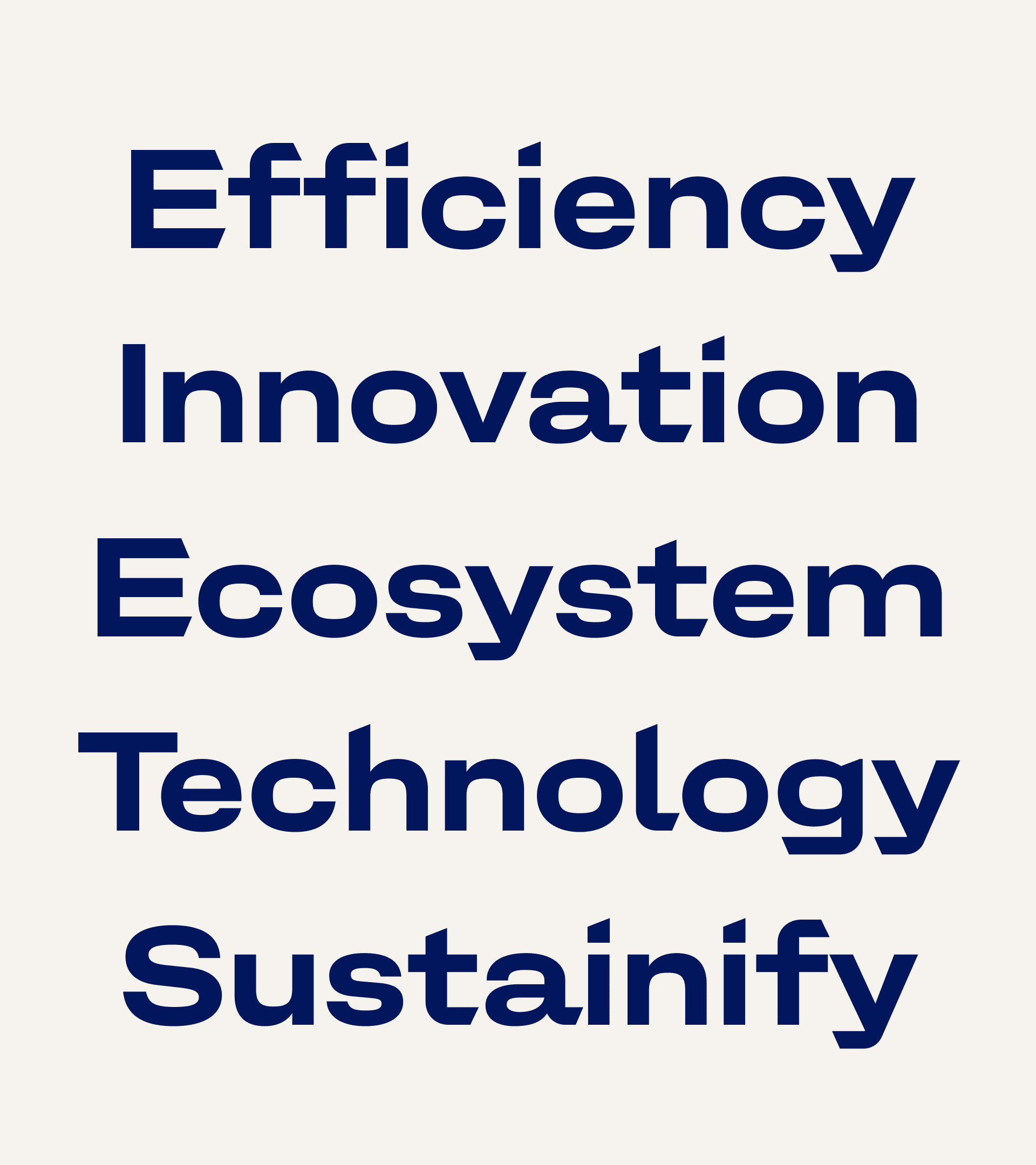
In collaboration with the design agency Mutabor, a revamped design system was developed that included the creation of a new brand typeface. The new typeface allows EKO to communicate in a fresh and distinctive way.

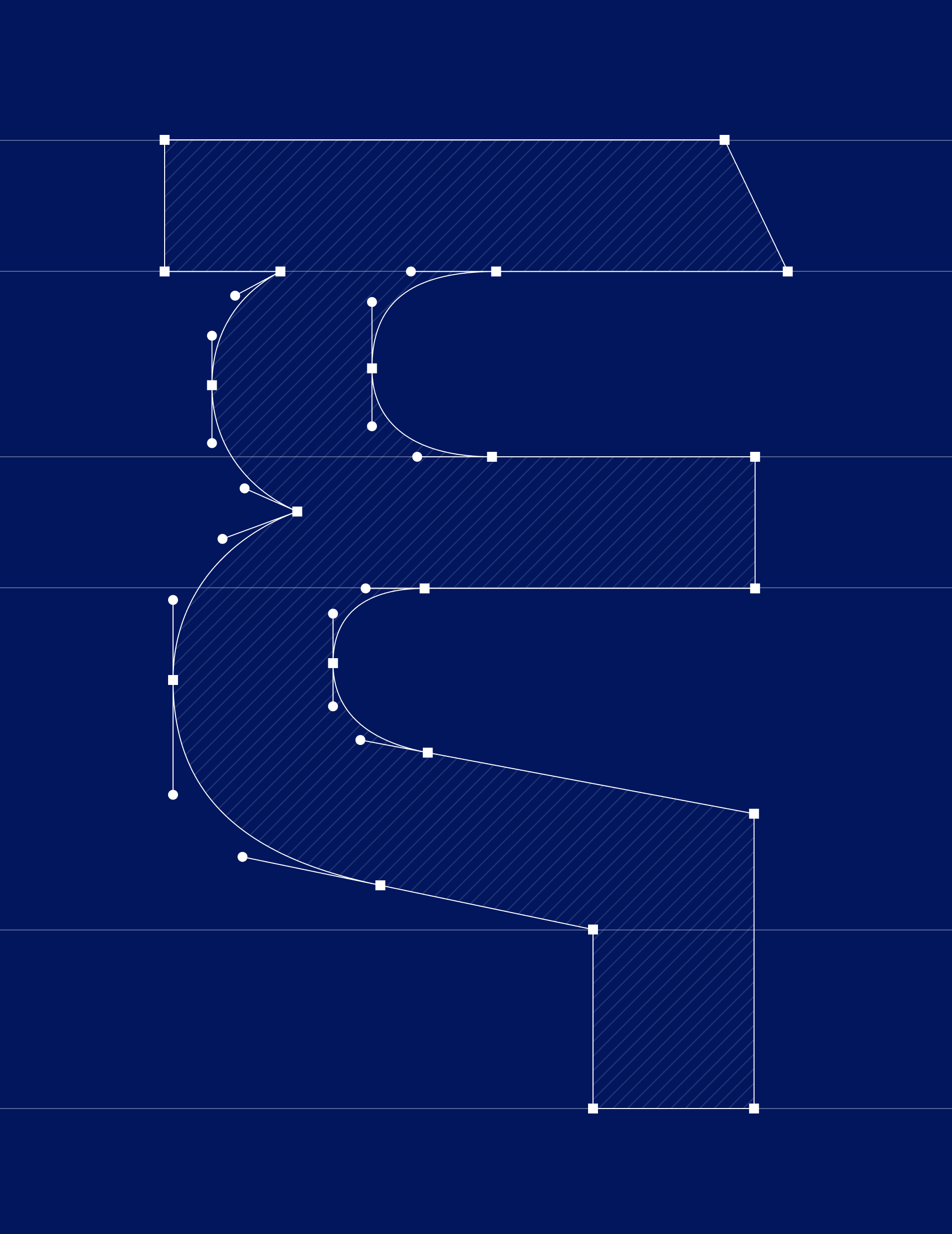
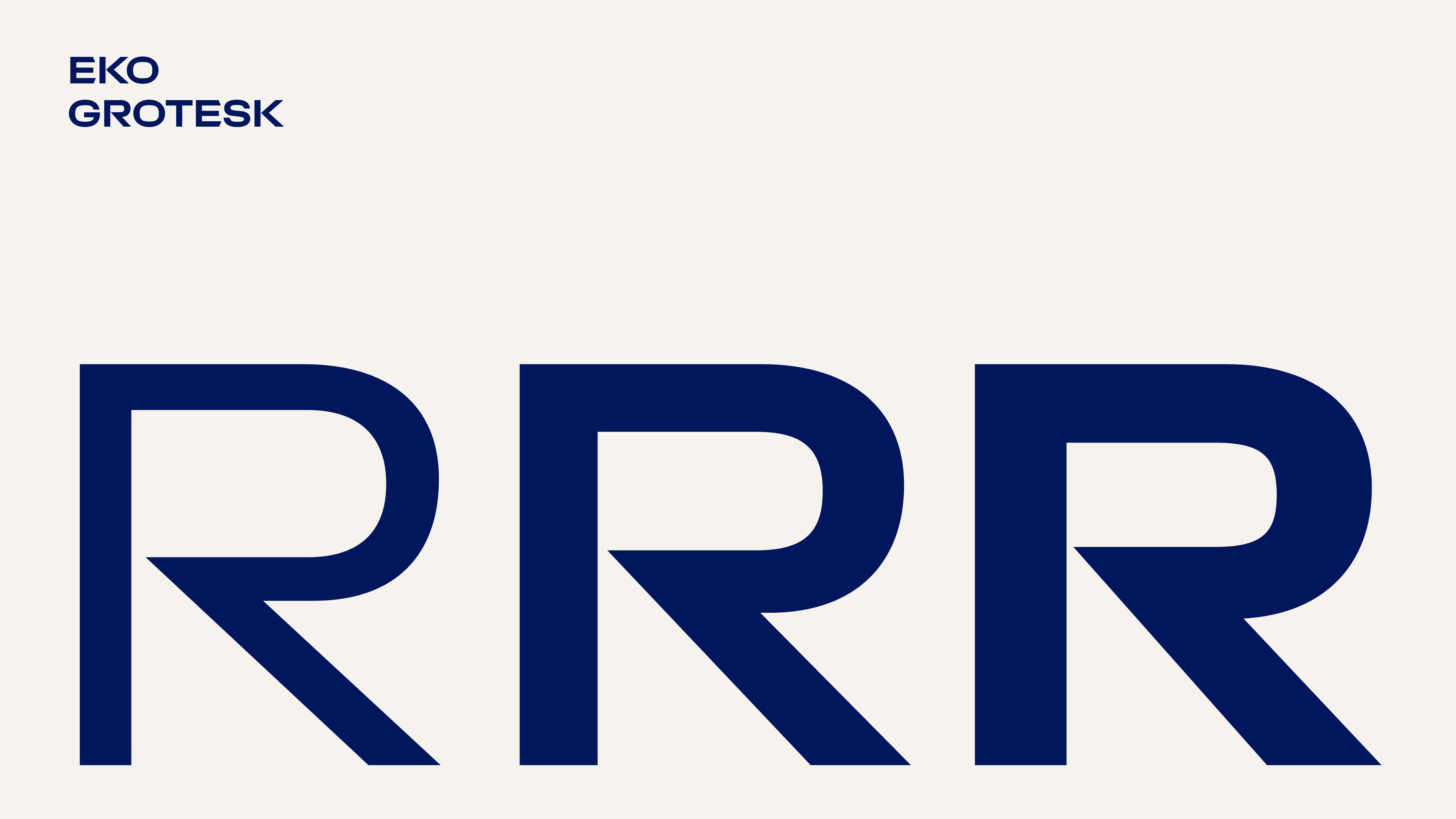
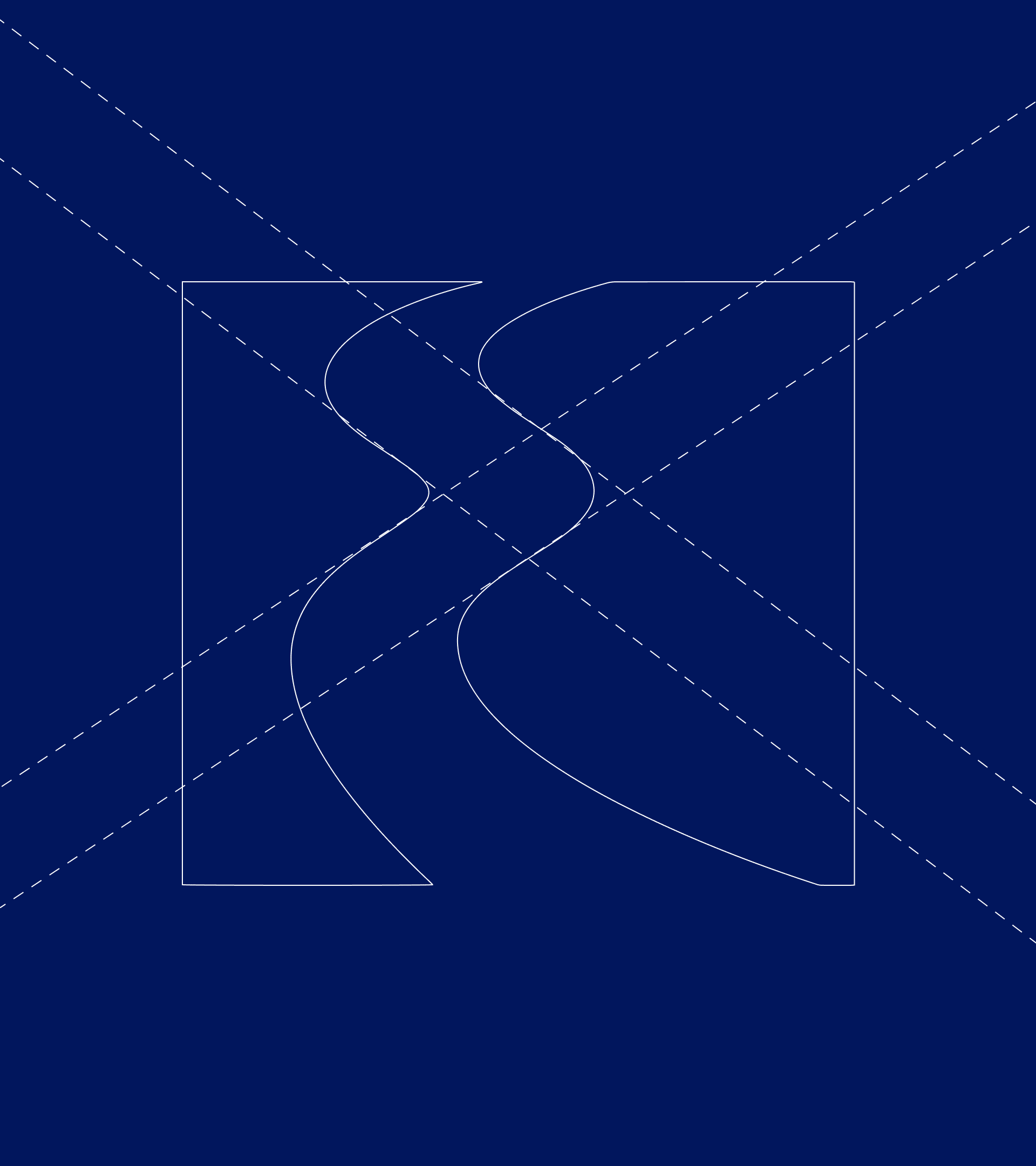
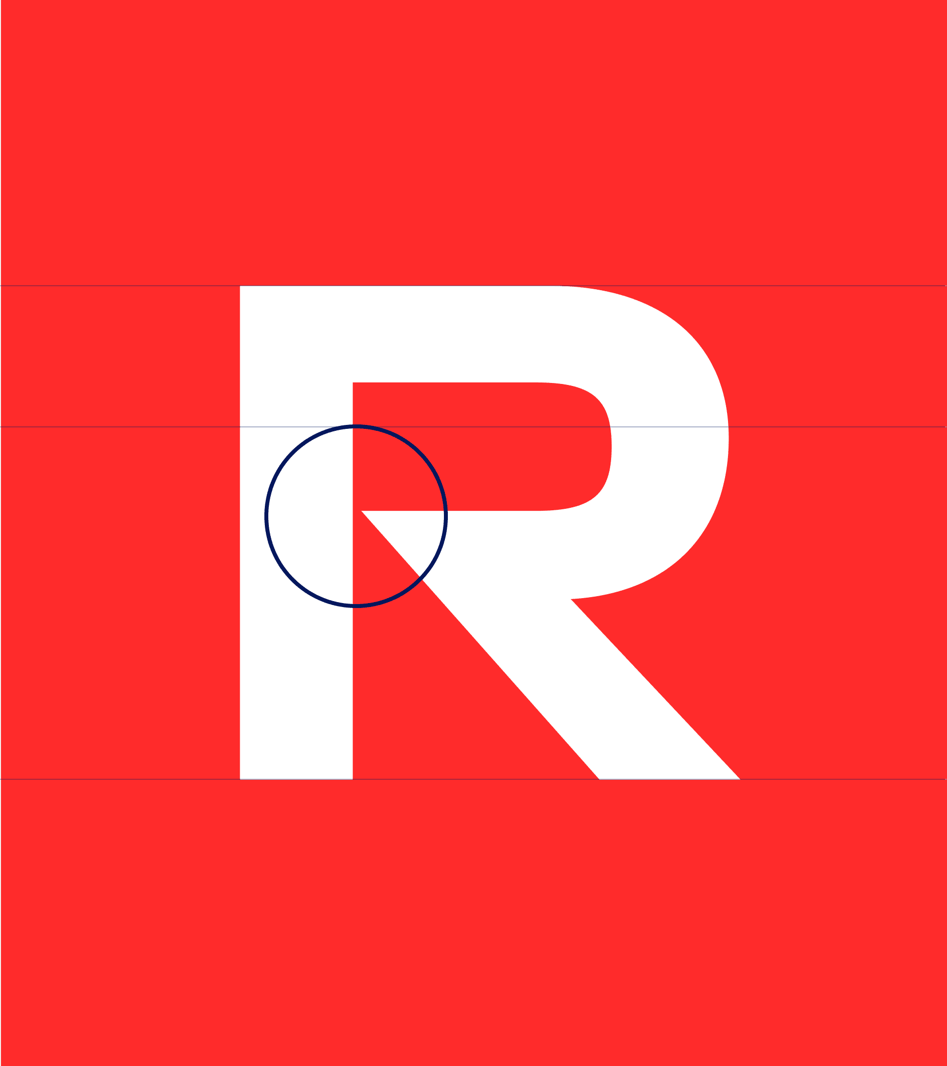
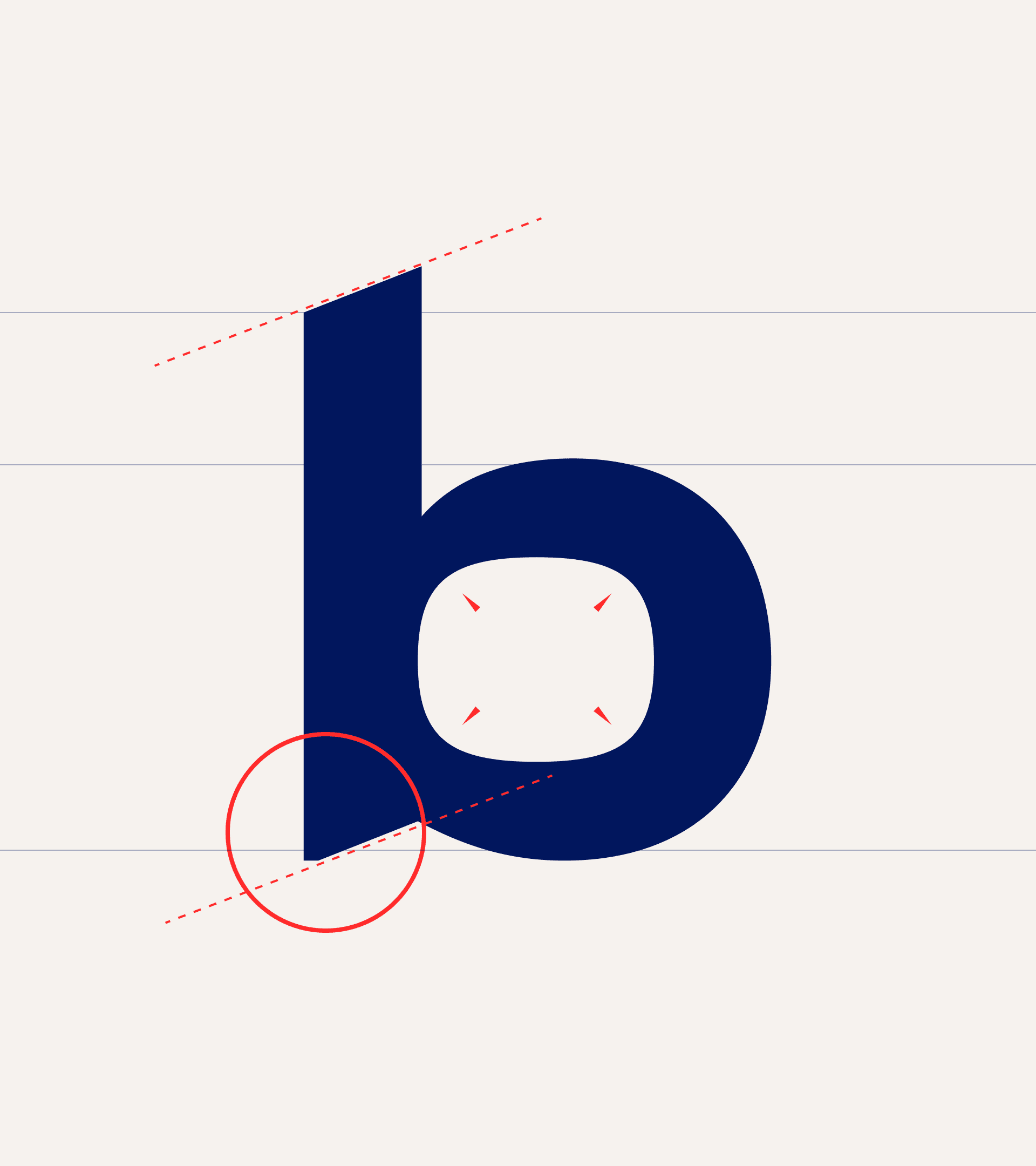
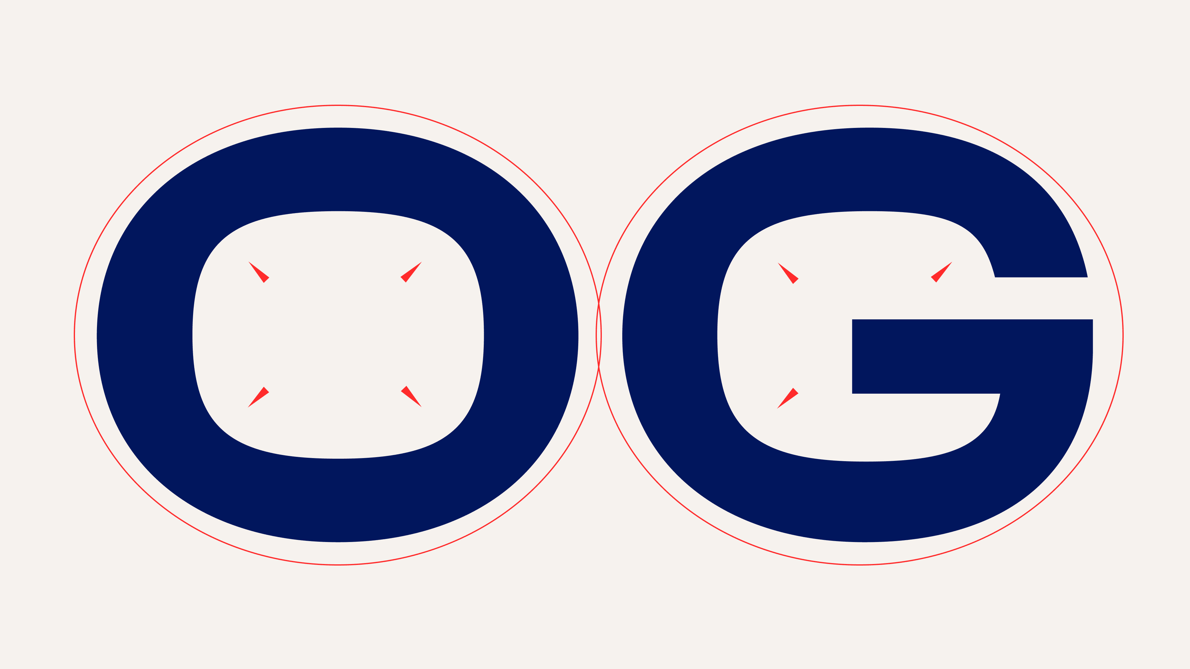
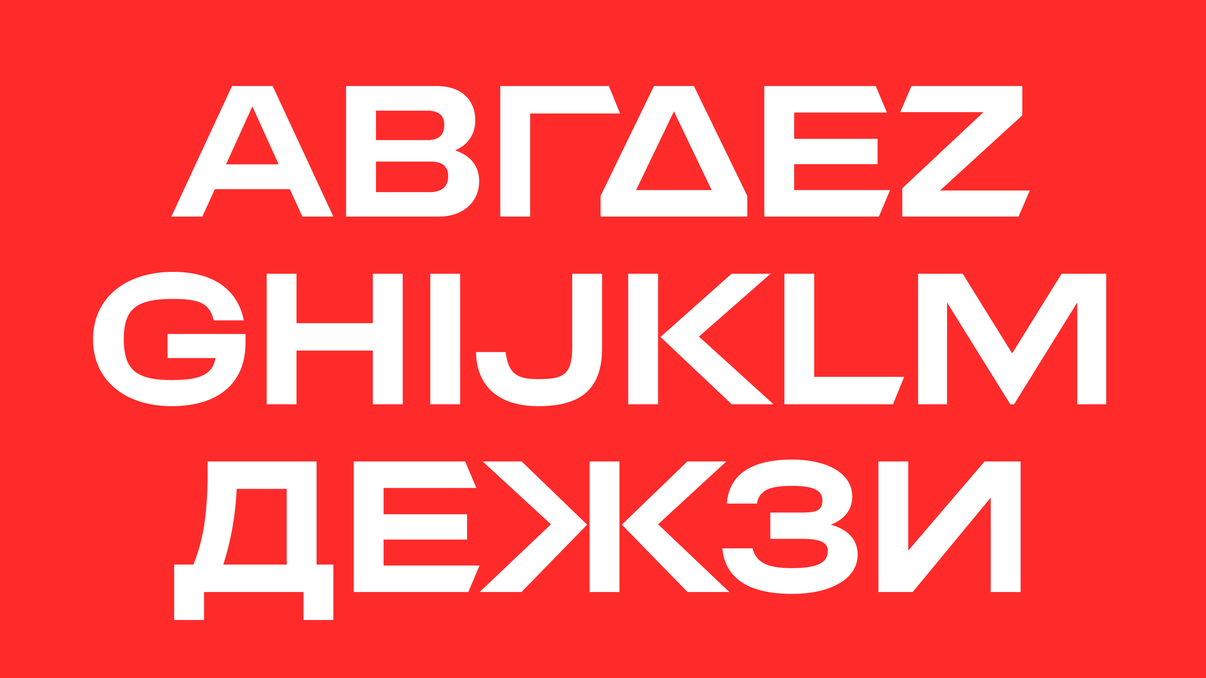
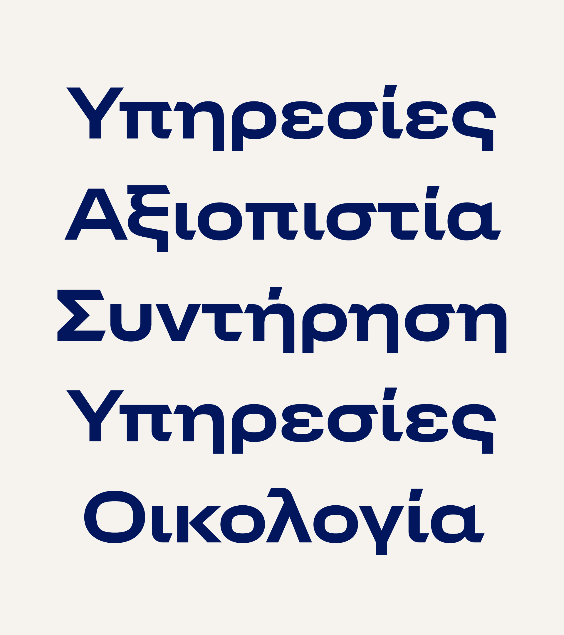
The starting point for the design was the angles contained in EKO’s picture mark. These formed the basis for the angular, cut-off terminals. The apex, derived from the center of the logo, was incorporated as a defining element to emphasize the brand’s dynamic and flexibility.
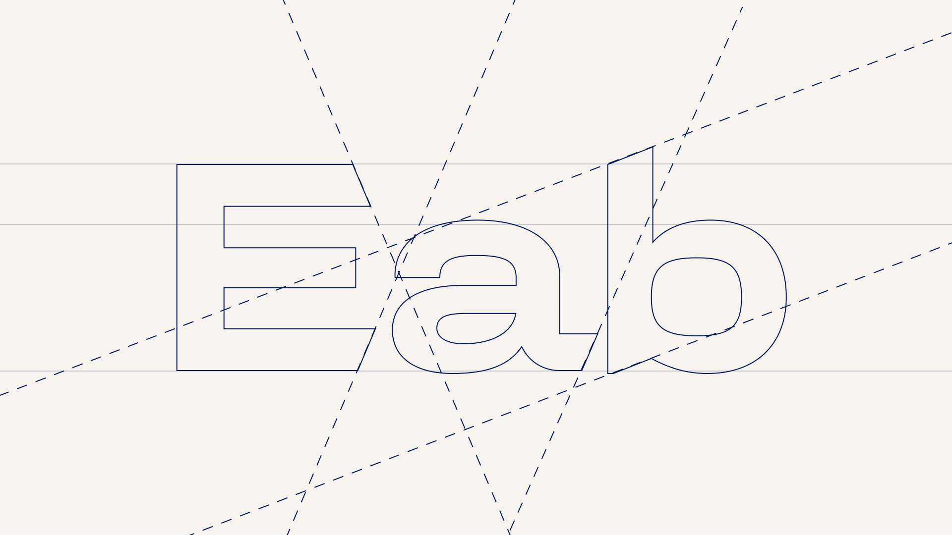
The interplay of humanistic warmth and technical precision gives the typeface a distinctive voice that reflects the brand’s dual focus on people and innovation.
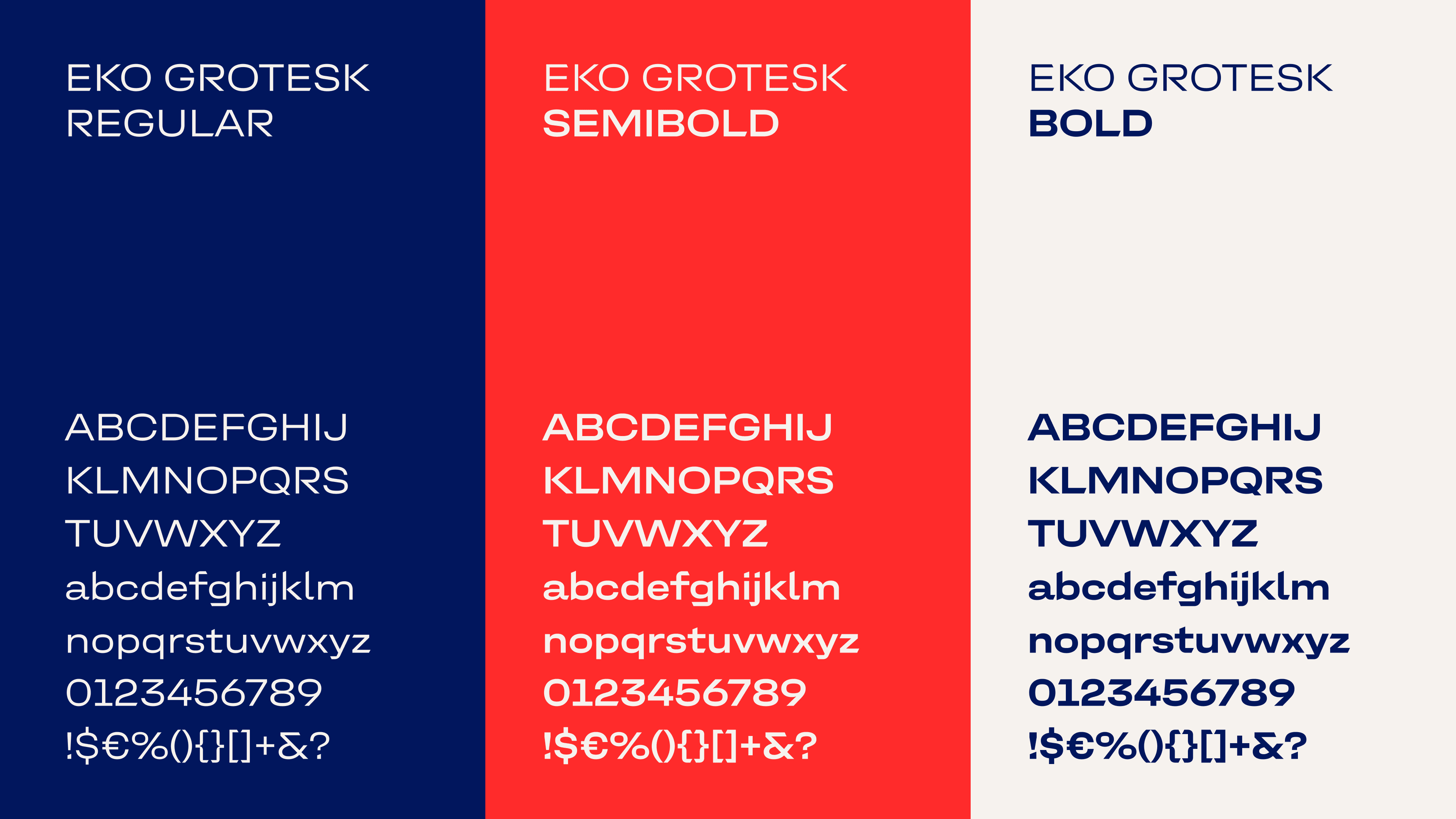
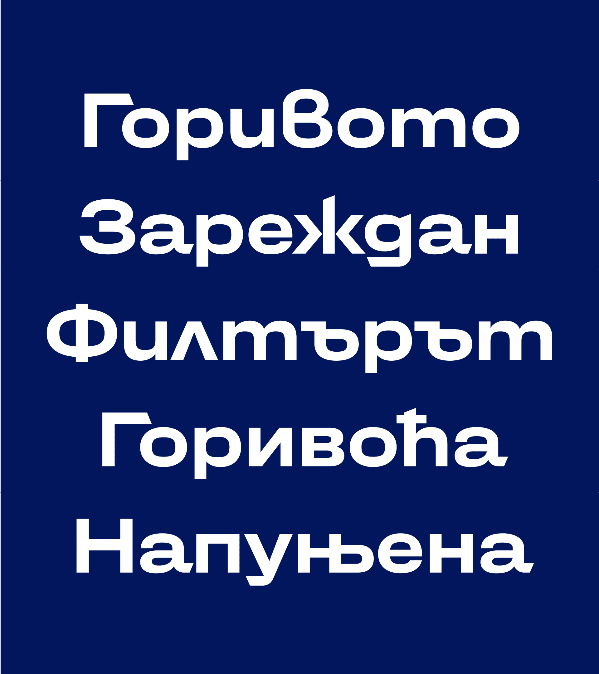
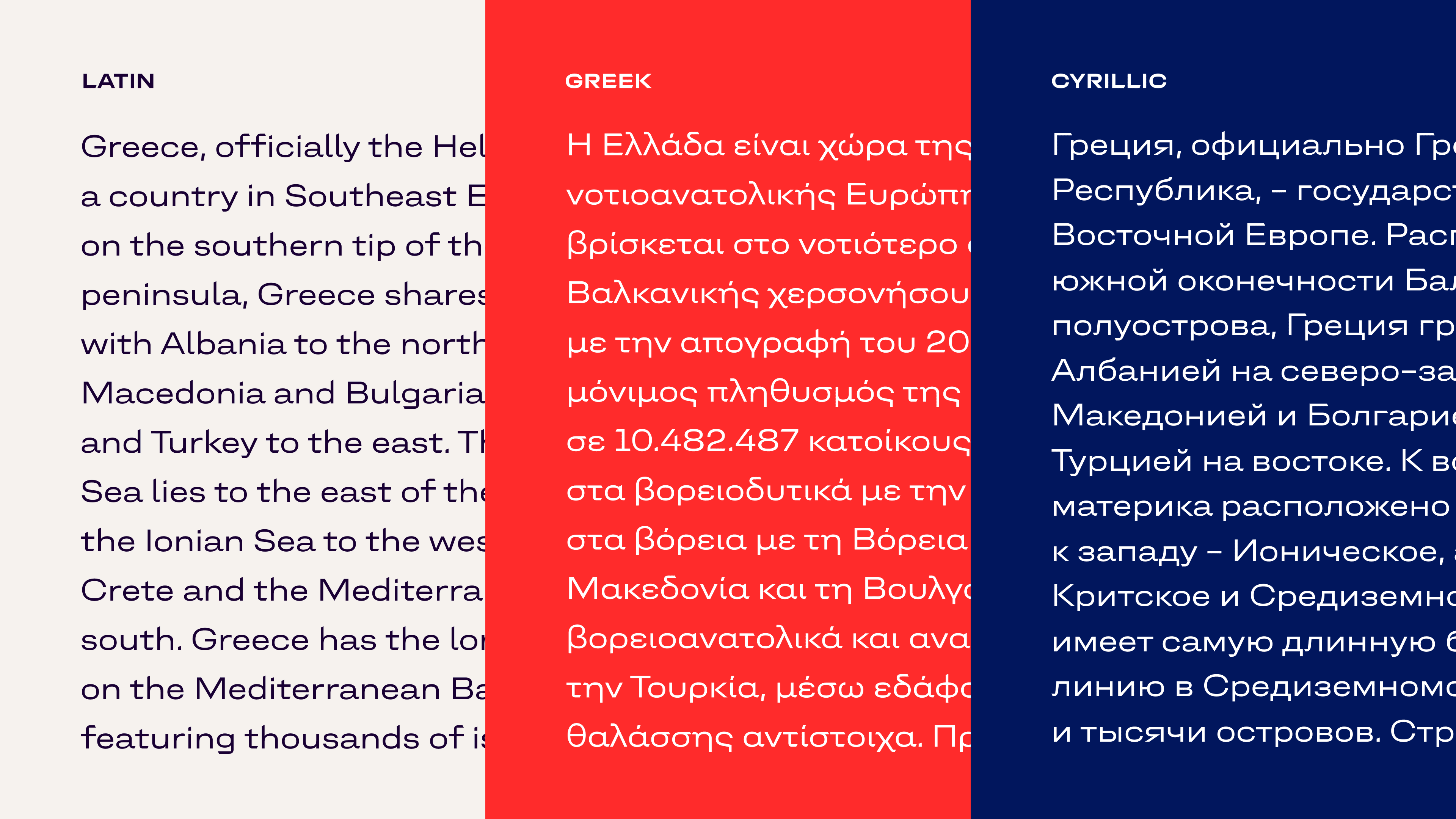
Since EKO primarily operates in Greek- and Cyrillic-speaking regions, the typeface family was developed in three scripts—Greek, Cyrillic, and Latin—to ensure consistent brand communication across all markets.
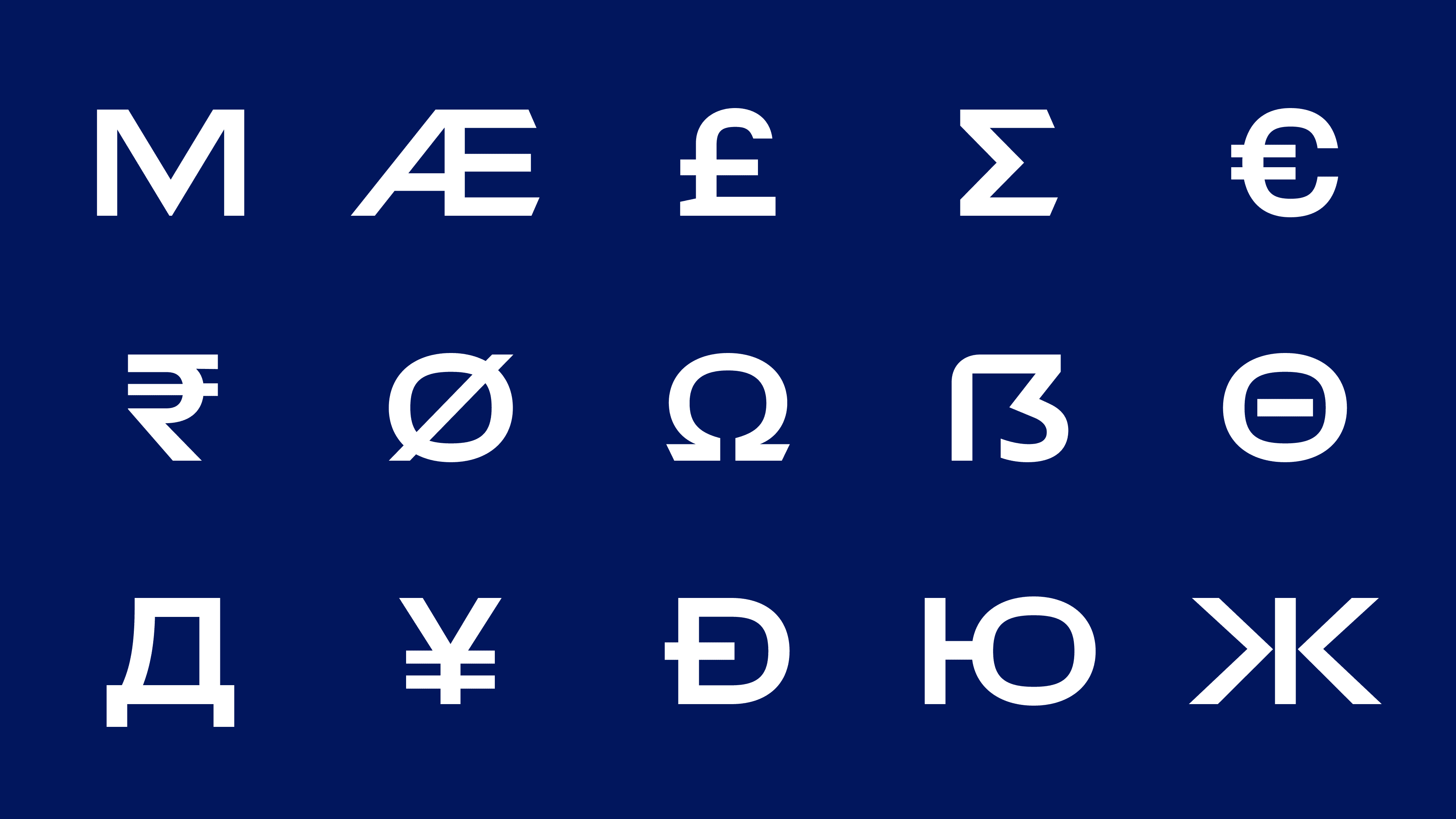
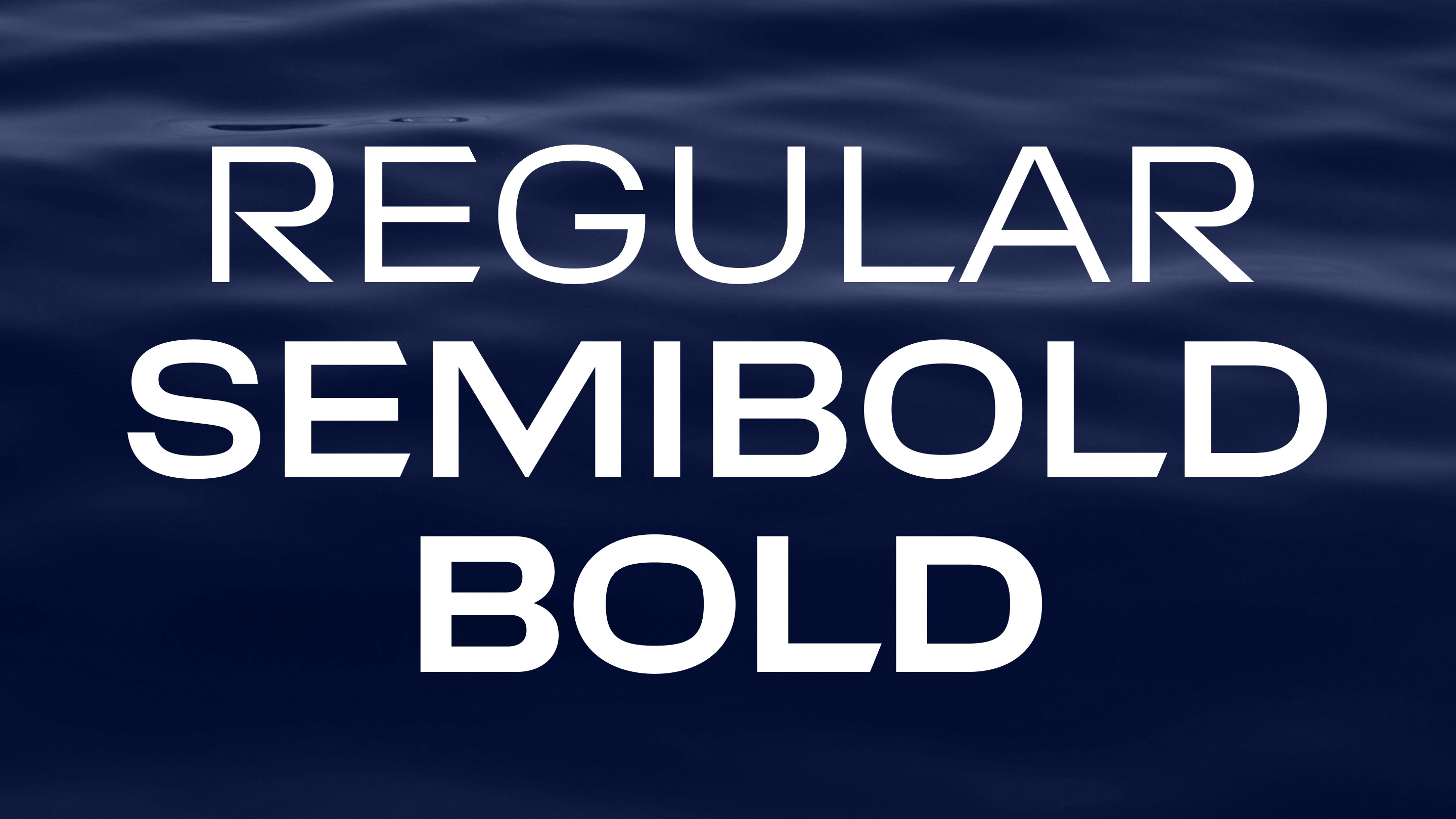
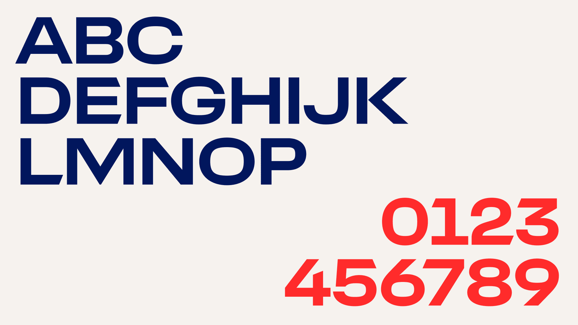
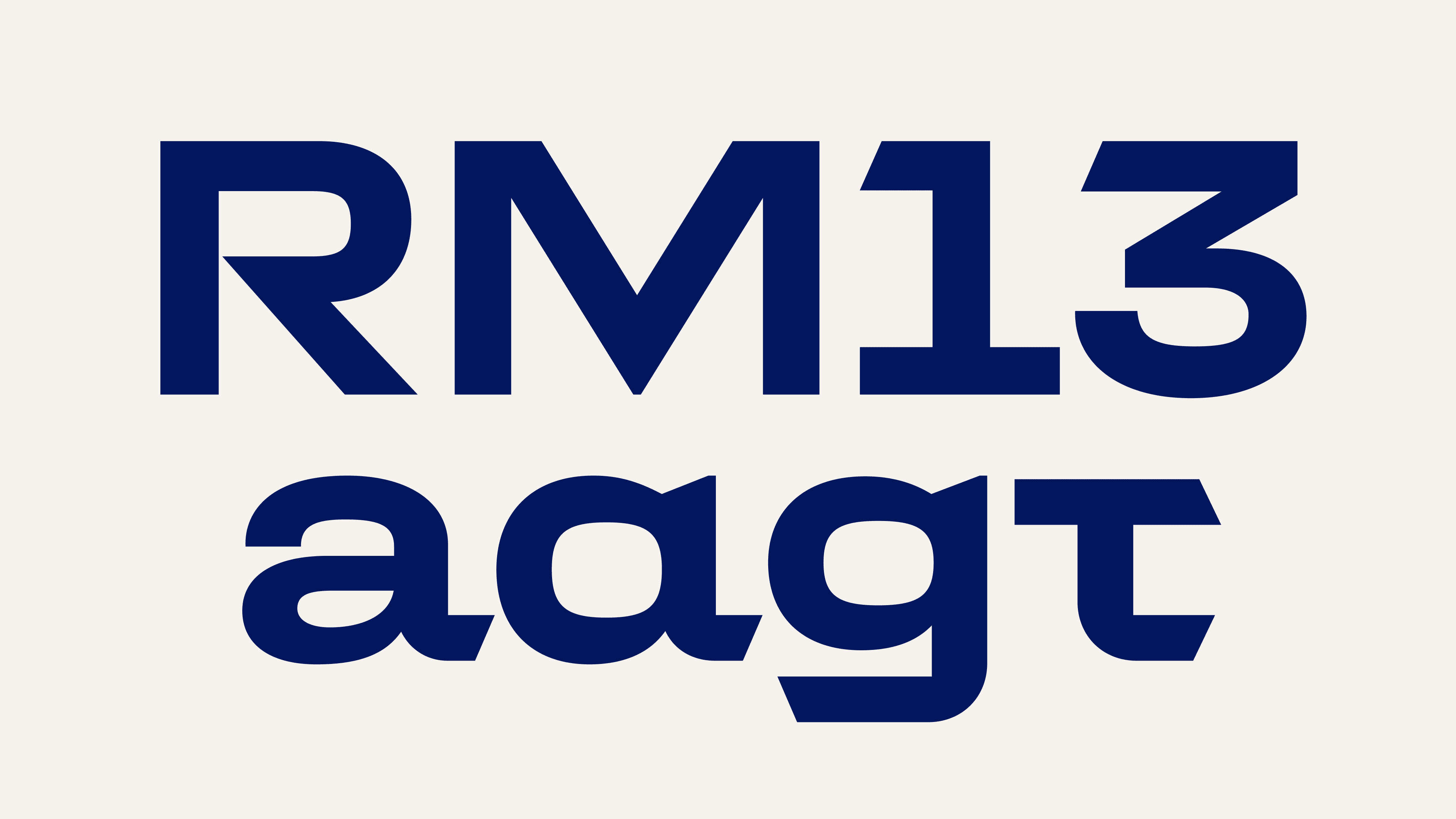
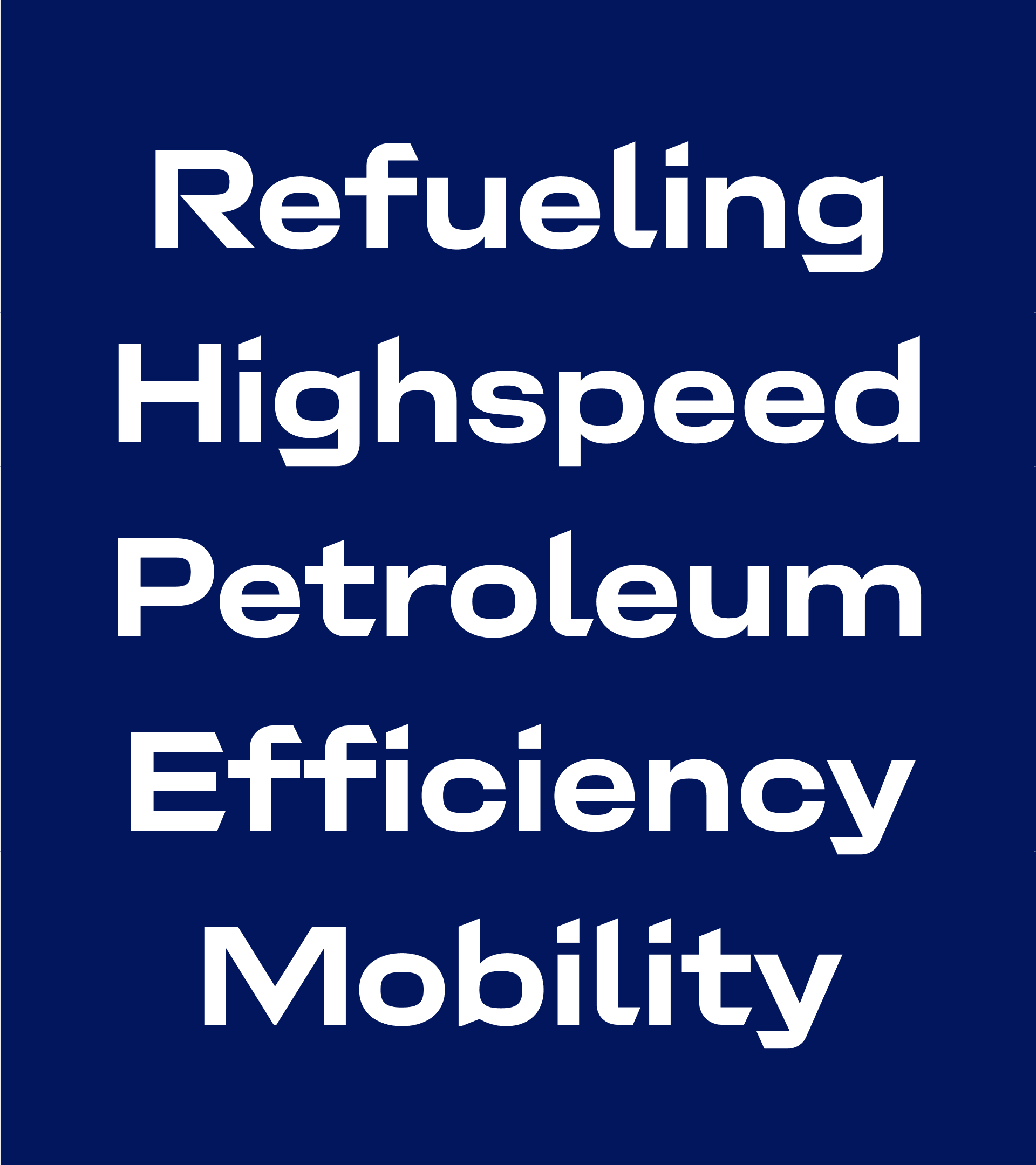
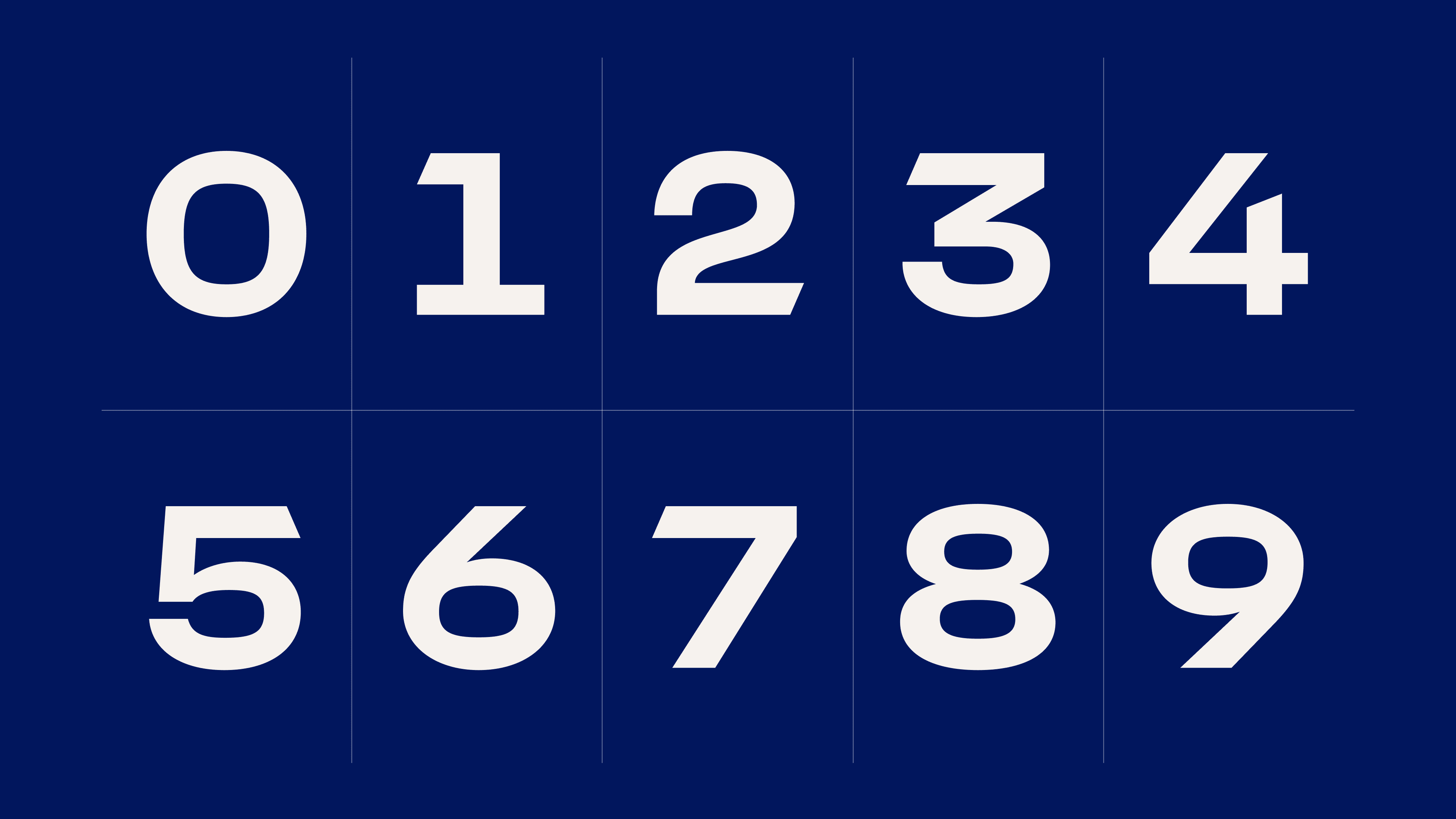
The typeface family includes three weights: Regular for body text, and SemiBold and Bold for headlines. Each weight contains over 700 characters and is carefully optimized for versatile use across print and digital applications.