DEUTZ is one of the world’s most established engine manufacturers, providing drive solutions for agriculture, construction, logistics, and industrial applications. Founded in 1864, the company is recognized for engineering excellence, technical innovation, and dependable performance.

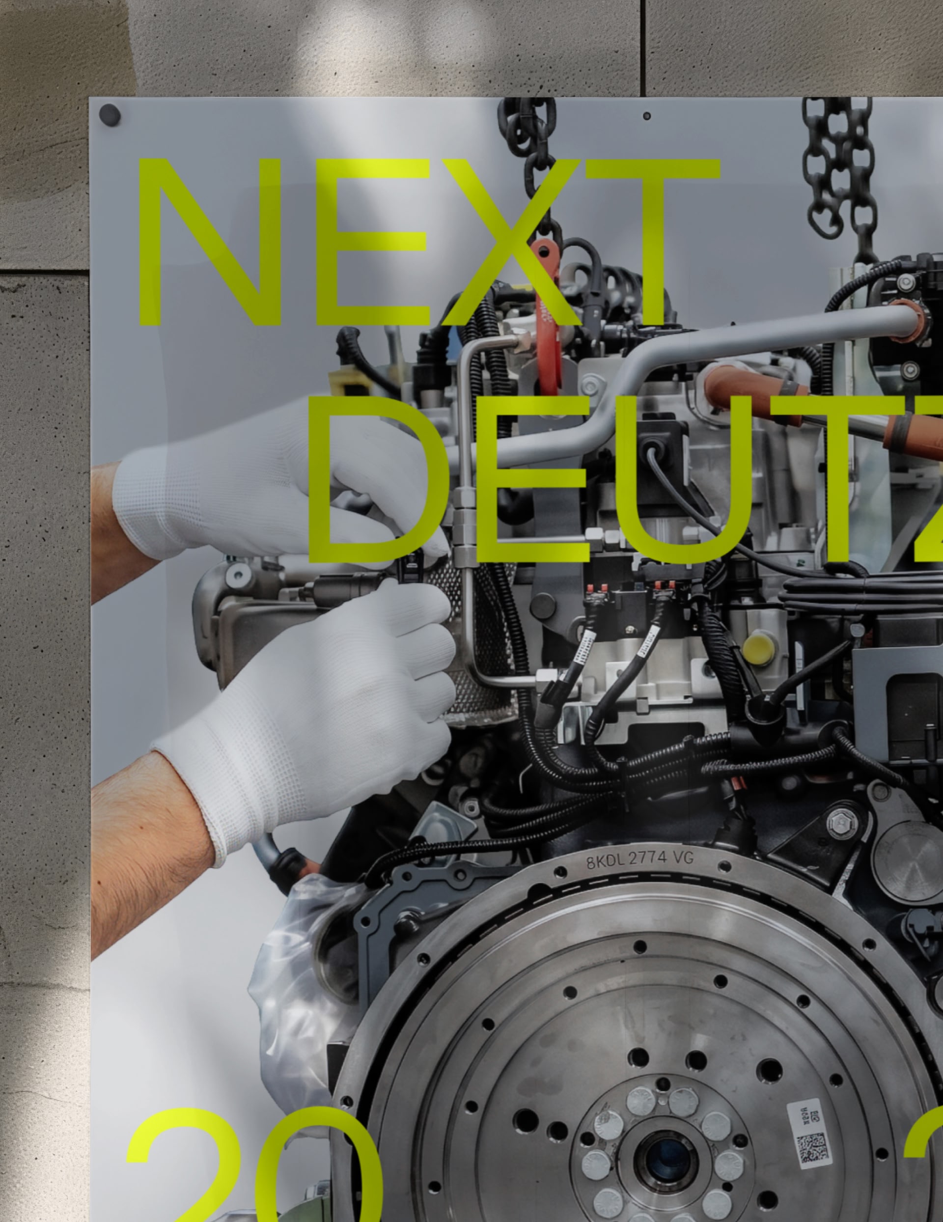
As part of the Next DEUTZ transformation, Strichpunkt developed a new brand identity designed to support the company’s future ambitions. Studio René Bieder was commissioned to create a custom version of Neue Faktum, translating the principles of precision, reliability, and technical innovation into a distinctive typographic voice.


Based on Neue Faktum, the typeface was carefully refined to align more closely with DEUTZ’s technical and straightforward character. Angled terminals were replaced by horizontal cuts, tapered joins were strengthened throughout the design, and selected alternate characters were integrated into the default character set. The result is a more robust and purposeful typographic voice while retaining the warmth and clarity of the original design.

Available in ten styles, the DEUTZ typeface offers a versatile typographic system for a wide range of applications. From Light to Bold, including corresponding italics, it enables a consistent visual language across digital products, corporate communications, and brand experiences.